Modelling the epidemic
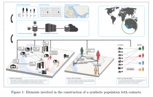
In the current situation (and any comparable state of emergency caused by an epidemic) much hope hinges on the statistical and epidemiological sciences that produce a model of an event like this by means of computational processing. Their scenarios are based on mathematical calculation work similarly to the forecasting of weather or the stock exchange. Probabilities are translated into progress diagrams and – more or less descriptive – scenarios along certain mathematical (or rather: stochastic) parameters, the construction of which includes historical data and assumptions about social behaviour. The visual form these scenarios take can range from a “simple” coordinate network to three-dimensional composite images like the one shown above (from a study on “synthetic populations” for modelling epidemics from the Network Dynamics and Simulation Science Laboratory at Virginia Tech). Epidemiology builds its scenarios in a manner not unlike other (e.g. economic, logistical, organizational) contexts: deploying certain theories and methodologies that are subject to constant discussion and renewal in the scientific communities.
Planning and organization studies have made a significant leap in development through big data and AI. Deep learning algorithms are continuously parameterized through the evaluation of social media data. Monitoring social behaviour becomes a prerequisite for modelling the course of infectious diseases and therefore also form the basis for decision-making and justification for the political and policing measures to be adopted. Nevertheless, the success of the algorithmic routines of these models and their predictions are persistently rooted in mathematical formulas, which occasionally take on a quasi-visual form in scientific papers.
A central formula for epidemiological modelling is that of the SEIR progression, in which “susceptible individuals in disease class S enter disease class E on exposure to a pathogen (ie, infected but not yet infectious themselves)” and “individuals in class E then transfer, after a period of latency, into the class of infectious individuals, I, only to transfer to a recovered or removed class R. ”
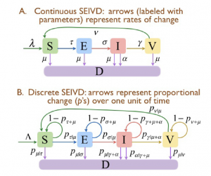
Flow diagrams for the basic SEIVD continuous (A) and discrete (B) time models with transition rates τ, σ, γ and ν from disease classes S to E, E to I, I to V
and V back to S, respectively. (Wayne M. Getz et al, Modeling epidemics: A primer and Numerus Model Builder implementation, Epidemics, 25 [2018])
Skilful visual representations in this scholarly-textual environment give plausible visualisations of development and spread, rates of change of the epidemic (and its increase or decrease) without thereby undermining the mathematical functioning of the formula. This engenders hybrid picture formulas or formula pictures that often seem to suffer the burden of the complexity and abstractness they are expected to carry.
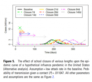
What should be of particular interest to parents, children and teachers alike, are studies on the efficiency of school closings during an epidemic like the present one. A 2015 American study on pandemic influenza concluded: “School closures may delay the epidemic peak of the next influenza pandemic, but whether school closure can delay the peak until pandemic vaccine is ready to be deployed is uncertain.”
aus: Isaac Chun-Hai Fung et al., Modeling the Effect of School Closures in a Pandemic Scenario: Exploring Two Different Contact Matrices, Clinical Infectious Diseases 60 (2015)
In order to investigate the reciprocity between school closings and the time of an epidemic’s climax, the research team built “a deterministic susceptible-infected-recovered model of influenza transmission” by dividing the population (here: the USA) into four age groups and “contact matrices” were created to model the average number of transferring but not physical contacts. The results were somewhat sobering: “For every week of school closure at day 5 of introduction and a 30% clinical attack rate scenario, epidemic peak would be delayed by approximately 5 days. For a 15% clinical attack rate scenario, a 1-week closure would delay the peak by 9 days. Closing schools for less than 84 days (12 weeks) would not, however, reduce the estimated total number of cases.” Only when a vaccine is introduced into the equation does the prognosis change for the better: “Unless vaccine is available early, school closure alone may not be able to delay the peak until vaccine is ready to be deployed. Conversely, if vaccination begins quickly, school closure may be helpful in providing the time to vaccinate school-aged children before the pandemic peaks.”
In the accompanying diagram (see above) a plethora of variants of the scenario has been processed. However, the generated coordinate image is not very meaningful to the inexperienced eye despite its use of various colours – it just seems too even, lacking any dramatic rashes, the waves/curves sloshing as if the surf is fully under control.
In any case, the real situation on an epidemiologist’s desktop will look more like the one in this figure from a paper on data management and decision-making, which was written on the basis of spread simulations: a large number of windows opened at the same time, which – see the principle of the “dashboard” – offers geographic map material, spectral diagrams, text fields etc. and seeks salvation (healing?) in the stratification, the overlap. TH
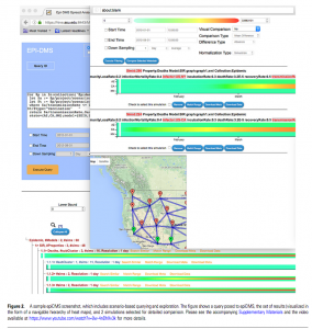
Sicong Liu et al., epiDMS: Data Management and Analytics for Decision-Making From Epidemic Spread Simulation Ensembles, The Journal of Infectious Diseases 214 (2016) (Suppl 4)
March 18th, 2020 — Rosa Mercedes / 02