Dashboarding the crisis
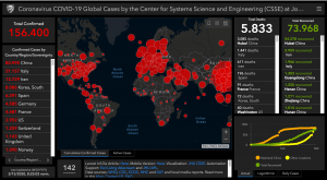
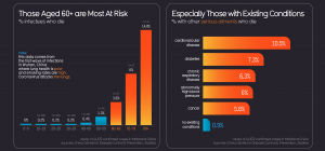
As the Coronavirus crisis evolves, it becomes harder to tell what kind of image the most publicised image of/on the crisis is exactly: Courtesy of the Center for Systems Science and Engineering (CSSE) at Johns Hopkins University (JHU), this info-assemblage of charts, curves, numbers, names, map has to be considered as contemporary’s control (or rather: panic) panel par excellence, the iconic polydiagram of the moment. There are other Corona dashboards available (to be used with great care as many have proved to be carriers of malware), but this one (perhaps alongside the sites of the New York Times, the WHO etc.) singlehandedly became the key reference site in the decision-making processes of governments, health administrations, executive boards, stock exchanges and newsrooms worldwide. On the – to date – “virus-free,” website updates on the global spreading of COVID-19 are being merged into a (interactive, zoom-able) sombre black map with feverishly alerting red dots, whose sizes correspond to the numbers of COVID-19 related infections and deaths in the depicted countries and regions (charted on the left and the right side of the central map). For weeks without end routinely opening this site on one’s personal browser faces one with the image that probably features most pertinently in the war rooms of the world. Observing the data at the quarantine called home (in durational performances of anxiety and dread), a prognostic habit is likely to settle as the default mode of perception. At the same time, however, Johns Hopkins’ COVID-19 dashboard is also eerily comforting. For, at least, the numbers seem to be properly quarantined and contained. Imaging the paradox of the control of the disaster, the corona dashboard has done a pretty effective job so far, eliciting alternative kinds of infographic creation, such as the one on the Information is Beautiful site. TH